Union
The Project:
Revisiting Inventory within the larger project of redesigning Union's Manager Portal
Role:
UX Apprentice
Date:
March 2023- July 2023
Team:
Konstantinos Riginos, Design Director
Ryan Levitan, Design Director
Annie Panousopoulos, Experience Strategist
Tools:
Figma, Notion

Visit
Union is a cutting-edge hospitality operating system developed to streamline operations in busy bars and restaurants. The system encompasses a Point of Sale (POS), a mobile app, and a manager portal, seamlessly working in together to modernize high-volume hospitality with an innovatively guest-led approach.
Overview
the big picture
The current manager portal experience is inefficient and cumbersome. Union asked Fix Studio to perform a UX teardown of the manager portal to make it faster and more efficient, and bring the experience in line with the quality of the mobile app and the POS. Working with Union, Fix has redesigned the entire experience from the ground up, prioritizing speed of data input, ease of data extraction, and guardrails for data accuracy.
The task at hand
One key feature of the manager portal is the inventory. Our examined the inventory journey, from inputting items into the manager portal to customers ordering the menu items in the venue. This case study will dig into one feature of the inventory journey: Menus.

Discovery
Our team performed a thorough evaluation of the current product. We interviewed users, interviewed stakeholders, and completed a heuristic analysis to discover the pain points along the inventory journey. Through the discovery process, I found that the way that menus exist within the current experience could be improved upon, both to cut down on the time that users spent building menus, and to enable Union to enact a feature that their users have been asking for called Revenue Centers.
Inventory: menus
The primary function of the inventory is getting menu items, such as beer, correctly plugged into the manager portal, to a POS screen or the mobile app menu, and into a customer's hands. The process of organizing items into menus can happen two ways in the existing portal: Users can create a new item and assign it to multiple existing menu screens, or users can create a new menu screen, and add multiple existing items to it.
.01 Add an item: flow
When adding an item to the inventory, users can add their menu items to multiple menu screens whose records are held on specific sets of POS devices or Mobile menus.


add and item: screens
-
Menu screens are organized by display size, including 10" , 13", online menus and Union Mobile menus.
-
Different menu screens with the same exist at different screen sizes, but don't have a common record
-
The only menu screens available are the Alphabetical menu screens (defined below)


.02 create a menu: flow
-
When creating a new menu screen, users are forced to only choose one screen type at a time: Alphabetical or Quick Picks.
-
Users also have to create the same menu with the same items multiple times for each screen type


.02 create a menu: screens
-
Menu screens can be laid out in two ways in the POS: Alphabetically, or Quick Picks.
-
Alphabetical menu screens display as a list format
-
Quick Picks exist as a drag and drop layout table, designed for venues to place the most popular items at the top of the display for ease of access.
alphabetical

quick picks

conclusions
I observed several problems within the workflow of adding items to menus and creating new menus:
-
Creating a new menu is a time consuming process, and users have to recreate the same menu manually for every device type
-
The lack of Quick Picks menus in the "add an item" flow poses a problem for users that are unaware of the Quick Picks menu options, and forces users to remember all of the menu screens they have created in the past
-
Menus are open for extensive user error, because users are forced to remember every item that is supposed to exist on a menu when they re-create it for a different screen type
user feedback on menus
Aside from the heuristic analysis, it was very important to get insights directly from users on what their pain points are. We performed several user interviews and distilled a list of problems they observed with the portal:
.01
Menu screens get missed in the process of creating a new item
“Nobody ever chooses the menu screens here. This is a commonly missed thing. Now I’ve built the item, but I haven’t chosen where it’s going to live on the point of sale or mobile app. So people publish items, go look on their POS, it’s not there, so they call support and I have to tell them that they need to publish it to a menu screen."
.02
It's currently impossible to publish a menu to a single POS. Menus get published to all devices that share the same screen size
“I want to be able to choose which menu screens live on which terminals. I want to publish an item to ONE POS, not all 13” screens at once."
.03
Because it's impossible to publish menus to a single device, venue owners can't create any reporting separation to create Revenue Centers within their venues
"Venues want to be able to split items by revenue centers, so that some items are only available on the patio, while other items are only available at the upstairs bar. Creating popups is a big trend right now, and it's a big customer request"
define
After ingesting all of the information about the menu screens and flows, we moved on to defining the problem and creating a solution.
problem statement
There's a missing step in the process of creating a menu: Menus themselves.
It became clear that the way that items are connected to menu screens is incomplete. Menus do not have their own record in the manager portal, and only exist in the context of the POS devices they live on.
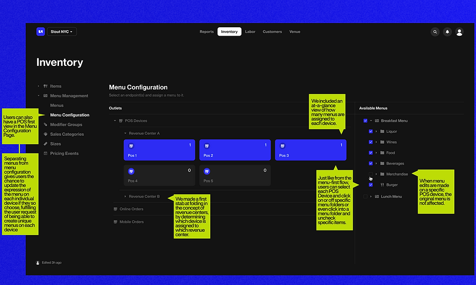
I proposed that we create menus as a single record, and assign the same menu to individual devices.
problem

solution

Stakeholder interview
In order to stress test the concept of menus holding their own record, we needed to find out why Union maintains the division between 10" screens, 13" screens, and Union Mobile menus. Were there technical concerns that we were not aware of? We interviewed the Union stakeholder in charge of setting up menus and answering inventory questions for venues, and asked why the division between screens existed.
findings
We asked the stakeholder who is the foremost expert on the current portal experience to walk us through any pitfalls we might not have anticipated, and ingested his concerns.
.01
Union wants to maintain a separation between the items available on POS devices and the Union Mobile Menu
"Users want to be able to limit the items available on their Union Mobile menus as compared to their POS menus. Separating the devices allows us to do that. It's kind of like hacking the concept of Revenue Centers, which is currently a big customer ask."
.02
The logic of adding an item to an alphabetical menu screen is easy, but users are required to configure the layout of the Quickpicks menu screens
"Because users have to actively curate the Quick Picks menu screens, they can't just add an item to a Quick Picks menu because the system doesn't know what to do with the new item."
.03
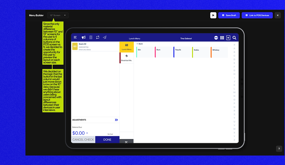
10" Screens and 13" Screens have different layouts
"The true difference between the two (10" and 13") on the POS is that on a 13" screen you can have five items across, and on a 10" you can have four items across."
conclusions
To proceed with the proposed solution, we would have to make sure that the new concept of menus worked within a set of considerations:
-
Menus will have to go hand in hand with the larger change within the system of Revenue Centers
-
Give users the ability to adjust the menu layout of different screen sizes
-
Ensure that users can still edit the instances of menus on each POS so that the exact items that they want to display on each device can be displayed
-
Create a logic around the way that different device sizes express Quick Picks menu layouts
wireframing
With the go-ahead to create menus as a single record, we began the wire framing process. The whole team worked together to nail down the logic during several rounds of all day Slack calls, and hundreds of screens.


round 1
Round one was a good start, but we were still too attached to how the current that the exact items that they want to display on each device can be displayed. We started considering alternate ways to organize the nav.


round 2
Round two was an improvement as we started to move away from the way that Union had the pages laid out, but we still hadn't nailed how to include the Alphabetical and Quick Picks views, or how the Menu Builder screen should exist within Inventory. We also began to consider how the menus and POS devices might exist in relation to the new concept of Revenue Centers.


Current iteration
The current iteration addresses all of the problems surfaced in the evaluation phase of the project, and ties neatly into Revenue Centers.


flows
After we nailed down all of the logic in the wire framing process, we codified it by creating an updated user flow.
Original Menu Flow

Updated Menu Flow

next steps
With the initial wireframes done, it's time to think about next steps.
.01
The Design Phase
Taking the designs from lo-fi to high-fi and smoothing out any bumps in the process along the way, revisiting logic if necessary.
.02
Stress Testing
Though we ran through as many edge case scenarios as we could think of, there is still room to double check that our logic fulfills all use cases.
.03
Stakeholder Approval
We also need to check with the stakeholders to determine if there's any steps or important factors that we haven't accurately accounted for.
