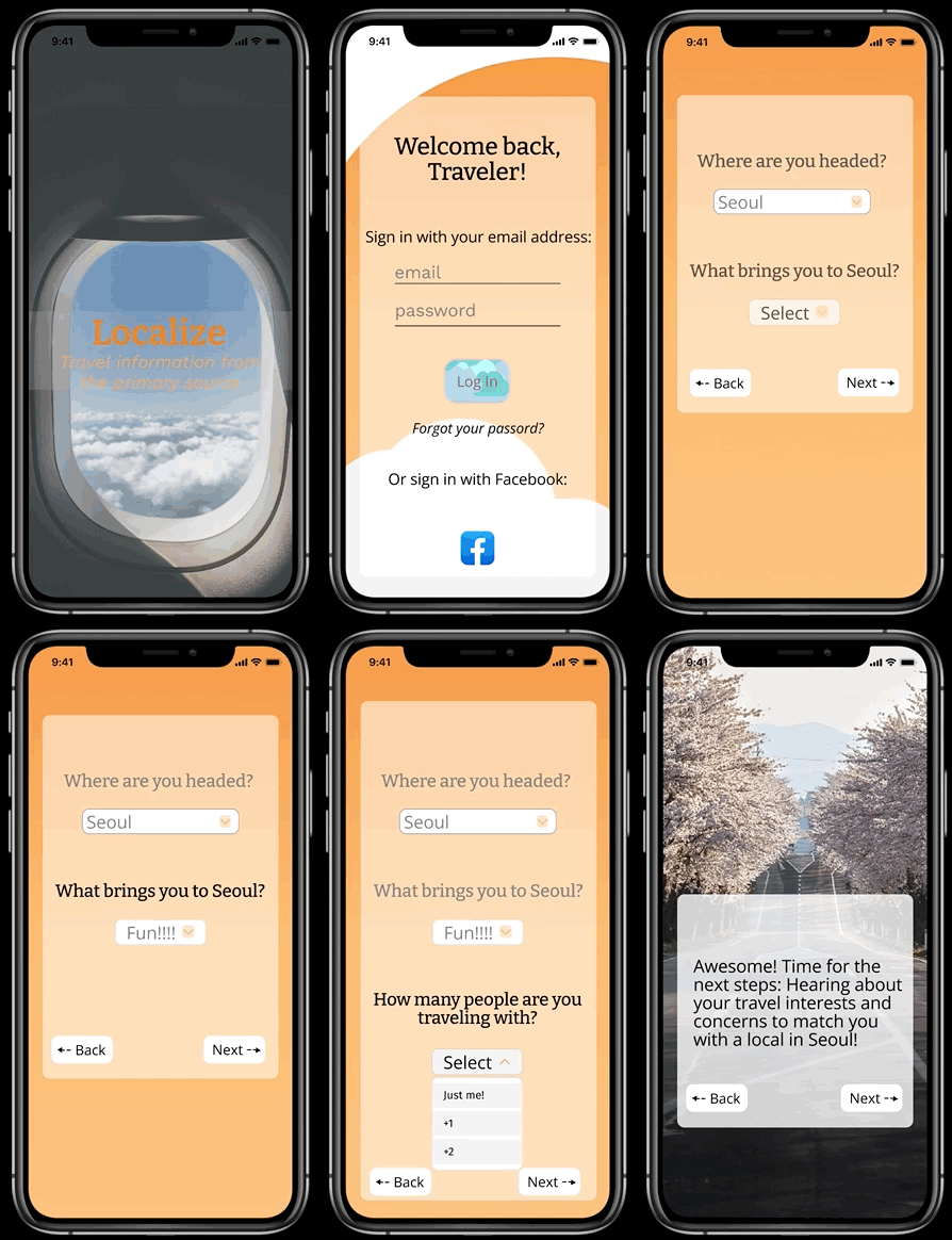
Localize: A travel app reimagined for a world on lockdown

Design Challenge Prompt:
Research and build a travel app during Covid.
Team:
Cassandra Broeker, Monet Hop
Timeline:
2 Weeks (September 2021)
My Role:
UX Researcher, UX Designer
Tools:
Figma, Invision, Miro
Overview
How have traveler's needs evolved during lockdown?
Monet Hop and I worked together to research this question, and then created our solutions solo.
My goal was to dive deeply into user research to discover how frequent traveler's needs had shifted during Covid. I discovered that more than ever, travelers need access to currently relevant local knowledge, and prefer to get their knowledge directly from the source.
Background:
Monet and I had both lived abroad for extended periods of time, and are experienced travelers. We compared the different ways we had gathered information to plan our trips in the past, and talked about how much easier travel is when you know a local at your prospective destination. When we first began the project, we decided to narrow our focus and centered our research on the question of "How do you gather information to plan your travel, and how has Covid changed your needs?"
1.1 User Interviews
We started the research process by creating an interview plan to make sure that we were gathering the same data. We needed to make sure that we had a unified methodology.
Participant Requirements:
-
Experienced travelers, preferably people who have traveled abroad
-
Between 20-50 years old
-
Not exclusively business travelers - some aspect of their travel needed to include leisure activities
Methodology:
-
Virtual user interviews will be conducted over Zoom, pulled from both researcher’s personal and professional networks to collect qualitative data
-
Interviews will be limited to 20 minutes
-
Each session will be recorded and transcribed
-
Video recordings will only be shared between researchers
Interview Questions:
Intro Questions
-
Tell us about your last trip?
-
With whom do you like to travel?
-
What are your apprehensions traveling during Covid?
Topic Specific Questions
-
Tell me about a memorable travel experience?
-
How do you typically find experiences?
-
Walk me through your planning process?
-
What resources do you usually use?
-
What was annoying about planning that trip?
-
How do you make connections on your trips?
-
What have been pain points in this engagement?
-
Tell me about a crisis you had on a trip and how you navigated that?
-
How has Covid changed your planning strategies?
Initial Data:
During the interviews, my goals was to dig deeply with my participants. Active listening, genuine curiosity, and asking a lot of 'why' questions helped us get to that space. The answers got more thoughtful and comprehensive as the interviews went on, and I gained interesting and unexpected insight from my interviews. Monet got equally as interesting answers. It was a lot of information that seemed to have few common themes at first glance.

1.2 Affinity Diagram
With our data gathered, we needed to make some order out of the chaos. We started with a silent sort to create an affinity diagram. When some common themes began to emerge, we discussed and titled the categories together, and then pulled out the interesting insights.

Interesting Insights:

Even though all of our participants were very different on the surface, all of them had one thing in common: They were looking for connection and authenticity.

Our participants all also valued local input. They all had different thresholds for tourist activities, but also wanted to have unique experiences of hidden gem activities that only locals would know about. In the past, access to relevant local knowledge had been helpful, and the lack thereof had been detrimental.
"I want to know what people who live here think is fun."
"I was expecting to hate south Turkey because Google says that it's super touristy, but I ended up loving it because it was less conservative."

Our participants also had some common pain points. Language barriers, non-specific recommendations, and lack of consideration for the unique challenges of traveling as a woman or a person of color came up frequently, but new Covid-specific anxieties were also emerging. Getting up to date information, navigating restrictions, and advice for avoiding crowds were some common themes.
1.3 User Persona
With our insights from our collective research gathered, Monet and I went on to complete our own projects, and I completed the rest of Localize solo. I pulled out the interesting insights, points of view, and pain points from our research and created a User Persona: Laura Trujillo.

2.1 User Insight
Now that I had created a user persona, it was time to pull an actionable user insight from it. This took several iterations, as I kept asking myself "Is there a deeper, more meaningful level here?"
First Draft: (not quite it!)

"Lara needs relevant local knowledge to plan unique and authentic trips, because she values input from locals"

Simple, but doesn't quite capture the depth of meaning I'm trying to convey.
Second Draft: (getting warmer!)
Tells me more about what Lara wants and needs, but I think there's still another layer deeper.


"Lara, an experienced traveler, needs relevant local knowledge to plan unique and authentic trips, because she values meaningful experiences and input from locals"
Final User Insight:
Lara, a traveler who craves experiences that she can’t get at home, needs access to local knowledge, recommendations, and insights that are difficult to find online because she wants to connect to the local culture at her destinations in a deep and meaningful way that goes beyond the most popular tourist attractions.
2.2 Problem Statement
With my insight into my user, I defined the problem I wanted to solve into a problem statement that gave me a good angle to start working from.
I believe that providing specific and relevant local knowledge and recommendations to travelers that want to be more than just tourists will help them connect deeply to new cultures, meet new people, and feel empowered to travel to new destinations.
2.3 Feature Prioritization
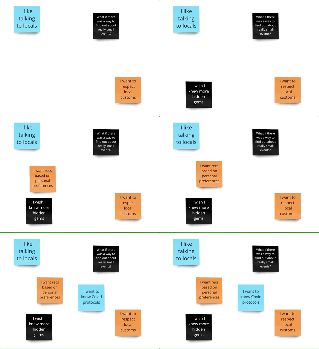
Now that I had defined my problem, I was ready to ideate on a solution. I started by brainstorming with the I Like, I Wish, What If method, and then created a Feature Prioritization Matrix to nail down which features that I wanted to create within the timeframe.
I Like, I Wish, What If?
I Like
During the brainstorming session, I put myself into Laura Trujillo's shoes and drew on all the data gathered during User Interviews.
I Wish
What If


This brainstorming session could have taken me in a ton of different directions, but when I went back to the problem statement, I realized: what better source of specific and relevant local knowledge is there than locals?

Lara wants as much information as she can possibly get about customs, hidden gems, and logistics before she goes to a new destination.
What if she could just... talk to a local?
I decided that this was my solution, and now I needed to get more granular and create specific features.
Feature Prioritization Matrix
I created a graph of complexity vs. impact, and chose to prioritize features with high impact and low complexity on the first pass.

The most important feature I decided to prioritize was the ability to chat/call a local at your prospective destination.

The second feature I decided to build was the trip planning preferences - I wanted to let my users indicate preferences and decide what they would want to talk to a local about.

2.4 Competitor Analysis
With potential features of the app taking shape, I decided to move on to analyzing four competitors to attempt to improve on what already existed in this space. I looked into Withlocals, Showaround, CityPals, and Eatwith.

Withlocals
An app that gives access to pre-planned tours given by locals

Showaround
An app that lets you connect with a local to plan individual tours

CityPals
A combination of the first two apps - personal and pre-planned tours

Eatwith
An app that allows you to plan meals at your destination with a local
Interesting tours that are pre-planned and tested with reviews
Can read the reviews of local's profiles before booking a tour
Cool and unique features like a "search near me"
Interesting way to experience unique foodie opportunities
Just a touring resource, not a planning or communicating resource
Only for paid tours. More focused on reviewing the local's profiles and making your own choice than on what you want out of your trip
Only communication allowed is about paid tours. Feels a bit like a meat market. Unattractive and frustrating UI
Communication is only regarding paid food opportunities.
Conclusions:
Even though all of these apps advertised themselves as an opportunity to talk to and gain input from locals at your next destination, they were mostly private tour planning resources. The focus was on picking a tour guide, rather than thinking about your own trip. I think that Localize can fill a gap in the market as a planning resource - giving travelers the opportunity to get local input in the form of chat or phone calls before or during their trip.
2.5 User Journey Map
After choosing features to focus on and analyzing potential competitors, I felt ready to visualize the journey a user might go on when using Localize, so I created a User Journey Map. What might trigger downloading Localize, what Lara's personal travel goals might be, and the pain points along the way that Localize could solve for here.

3.1 Onboarding and User Flow
With Lara's journey through Localize mapped, it was time to think about the actual flows. I created two flows: The onboarding flow and the trip planning flow. I needed to test them together to ensure that they weren't overwhelming, and that I wasn't asking for too much information and investment from my users all at once.
Onboarding Flow:
What information do I really need in order to onboard my users, and what information can I afford to leave out?

Main User Flow:
What do I want my users to think about when they're planning a trip? How can I coach my users through?

3.2 Sketching and Wireframing
After mapping out the necessary steps in the process, I started to sketch screens. After a quick round of feedback, I created my low-fi wireframes.
Sketching
During the sketching phase, I thought a lot about the writing and what information Lara would need as she signed up for the first time. I tried to keep each step as decision-light as possible, in order to minimize decision fatigue. I received feedback from Monet, and made some minor tweaks going into the low-fi wireframing.
Low-Fi Wireframing

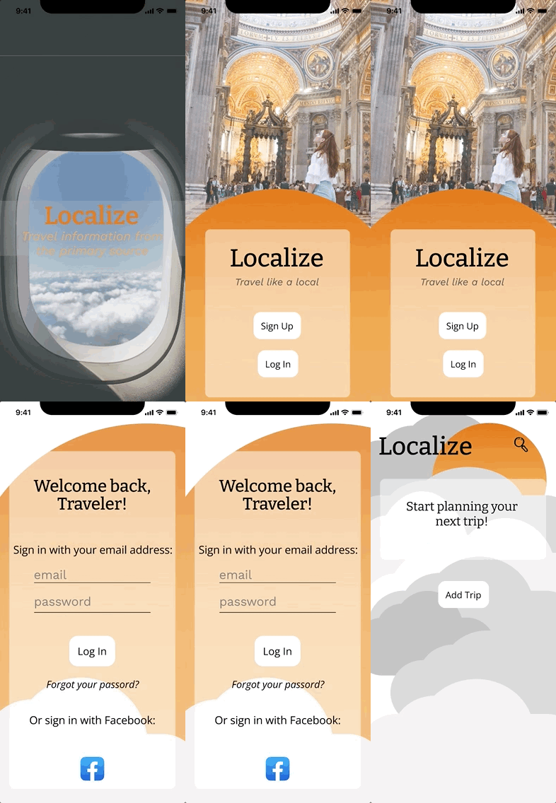
Splash

Login/Sign Up
The loading and Login screen were designed to communicate that this is a travel app, and a way to learn about new places from locals

Login

Home Page
The Login flow takes returning users directly to the home page, where they can see their currently planned trip


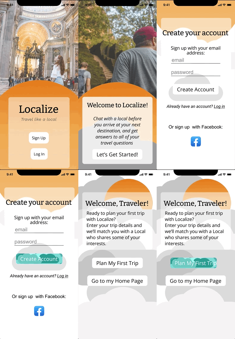
Coaching
Sign Up
Permissions
The sign up option takes users through a coaching screen before letting them create their account, and leads into the "plan a trip" user flow
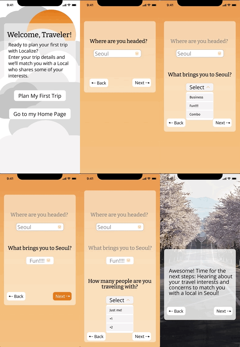
I designed the "plan a trip" flow to be short and sweet - what does information about Localize does the user absolutely need in order to plan a trip effectively?


Destination
Interests
Concerns
Local Match
Local Details
3.3 User Testing
Now that I had created my screens, it was time to test them. I performed four remote moderated user tests, gathered the data, and made changes going into my mid-fidelity wireframes based off of the feedback I received.
User Testing Plan
I tested Localize with four users in a Remote Moderated User Test over Zoom. I asked my users to imagine that they are planning a trip to Seoul, South Korea, and that they have downloaded a new travel planning app. I asked them to accomplish three tasks, and I determined their success based on both verbal feedback and from watching their clicks on the prototype.
Testing Tasks:
Task 1: Sign up for a new account and begin chatting with a local.
Success Criteria: The user gets through the whole flow without getting stuck for longer than 10 seconds.
Task 2: Log in, not sign up, to your account and begin to plan a new trip.
Success Criteria: User finds the correct buttons with no delays longer than 10 seconds.
Task 3: Sign up for a new account and instead of setting up a new trip, go straight to the homepage
Success Criteria: The user finds the "skip for now" button on the first page after the sign up flow.


Testing Results:
Task 1: 100% of participants completed this task successfully and began chatting with a local with no problems.
Task 2: 1 participant got confused and accidentally signed in instead of signing up before going back and correcting that mistake. The rest of the participants completed the task successfully.
Task 3: 2 participants missed the "skip for now" button on the destination page and only realized that they could go directly to the home page a few screens later. The rest had no problems.

General Issues:
Next Steps:
Based on feedback, I definitely had some work to do! The overall message was that Localize was pretty plain and boring - there was no spark of joy. I set myself a list of fixes for the next iteration based on user feedback.
Issue 1: Smooth out the UX writing, and include fewer words per page.
Issue 2: Add in more visual interest over all screens - make it less boring, and more joyful.
Specific Issues:
Issue 3: Change the skip for now option on the first page of the trip planning flow into something that's more attention grabbing to give users the opportunity to go straight to the home screen.
Issue 4: Give more coaching and explanation on what the interests and concerns screens purpose is, and what information it's trying to gather.
Issue 5: Fully flesh the interests and concerns line items out, based on my previous user research.
Log In and Sign Up Flow
3.4 Mid-Fidelity
For my mid-fidelity prototype, I made changes based off of user feedback. I cut down on the wordiness, made the specific fixes I needed to, and tried to inject more fun, joy, and visual interest to every page.
Main Flow - Planning a Trip
Step 1: Trip Details
Rather than one screen with instructions, one action, and a skip option, I split the beginning of the trip planning flow into four screens. I made the skip option into an entire coaching screen that provides an explanation for the trip planning process that's about to happen. I then split the information gathering into three interactive screens that ask users where they're going, why they're going there, and how many people they're traveling with.


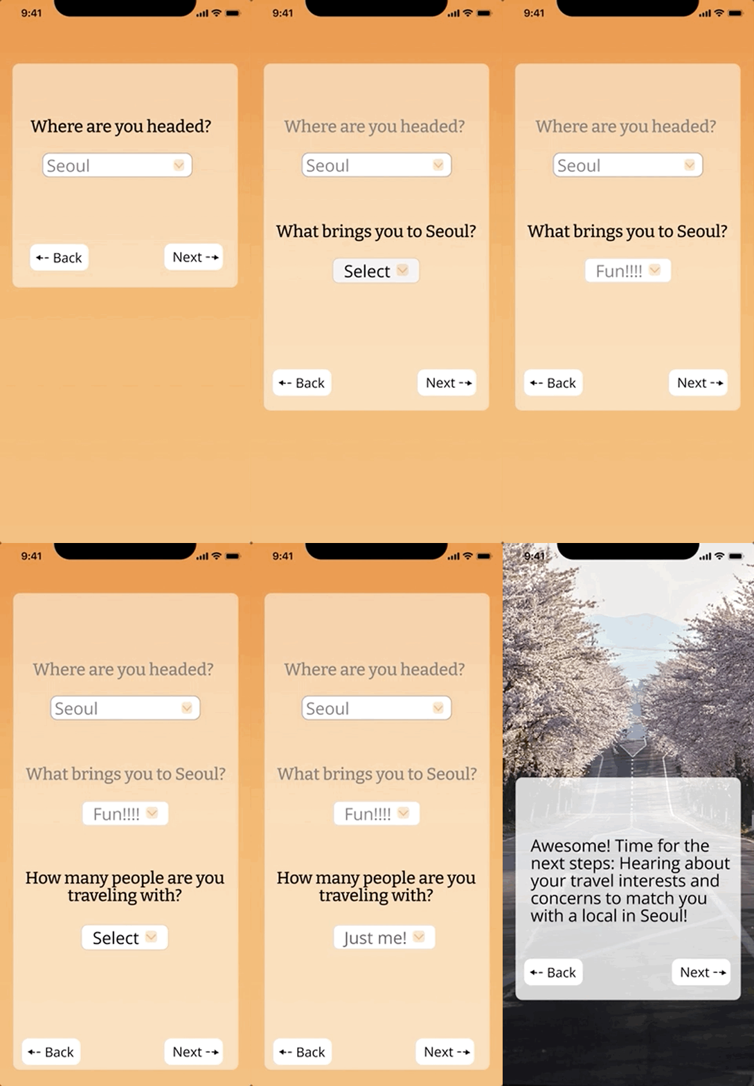
Planning A Trip Flow
Step 2: Travel Interests
It was very important to clearly indicate the purpose of gathering interests, so I added a coaching screen, to let users know that their preferences would be taken into account when choosing a local to chat with. I also tweaked the UX writing on the screen itself. I chose the categories to include based on my original user research and the travel interests that my users had brought up. To inject a little bit of whimsey and fun into the process, I put the interests on a slider rather than a checkbox, to honor that preferences often aren't binary.


Step 3: Travel Concerns
For the travel concerns, I also added a better explanation at the top of the page, and drew the specific concerns from my original user research.


Step 4: Local Partner Selection
Choosing a local to chat with also needed an infusion of joy and interactivity, and I put more thought towards what type of information a user might want to know about their local contact, and I included an example bio.


Step 5: Local Details Page
In the details view of potential local contacts, I included an explanation for why a user might be paired with a particular contact - shared interests.


Step 6: Chat
I took the opportunity to flesh out the chat design, and included a header with reminders of which local the user is talking to, along with profile pictures.


3.5 Clickable Prototype
With the mid-fi design fully fleshed out, I created interactions between screens and made a fully clickable prototype in Figma.
1.4 Lessons Learned
I learned a lot about myself and my design style through this process. I learned what works for me, what doesn't work for me, where my strengths are, and some areas that I can work on.
My Biggest Takeaways

One of the most important lessons I learned was that when in doubt, go back to the research. When I got stuck, I always got unstuck when I revisited the user interview data, user persona, and problem statement.

Another important lesson was to trust my instincts as a designer, but them validate them. Always check your assumptions at the door, because you get the best data with an open mind.
4.2 Next Steps
Given the chance, I would love to take Localize to the next level and add more interesting features and explore a high-fidelity product.
Immediate Next Steps

I would absolutely love to do another round of user testing, as well as a round of usability testing. I think that a high-fi version of Localize could use a lot of refining.

I think that a High-Fidelity Prototype would be something interesting to explore with Localize, taking in the feedback to my mid-fidelity prototype.

A feature that I would love to add would be a save feature - the local contact could send the user links to articles or events or ticket booking sites, and the user could save all of the recommendations in one place.


