Cassandra Broeker

Inside Books Project:
A website re-design for a Non-Profit dedicated to serving Texas inmates

Overview:
Myself and a team of three other UX designers teamed up to redesign the web presence of Inside Books, a Texas non-profit dedicated to providing books and resources to Texas inmates. After analyzing the existing website, we determined that Inside Books Project needed a website that lends credibility to their work and gives users a clear path to get involved.
The Brief:
Redesign an existing website
Timeline:
3 weeks December 2021-January 2022
Team:
Cassandra Broeker (me!) Monet Hop, Nicole Stewart (PM), Amy Taylor
My Role:
UX Designer, UX Writer, UI Designer, Content Writer
Tools:
Figma, Miro, Invision
Diving into this project, we needed a deep understanding of the organization we were designing for. Inside Books Project is an Austin-based nonprofit that works to promote reading, literacy, and education among incarcerated individuals and to educate the general public on issues of incarceration. Our design needed to serve our users while also aligning with the needs and values of Inside Books.
PROTOPERSONAS
As we started investigating Inside Books's current website, we saw that there were three main ways to get involved: Donating books, donating money, and volunteering. We created three separate protopersonas to investigate each avenue of engagement.
Clara: Donates Money

Current Site
With a conceptual model of our user's needs in place with the protopersonas, we annotated the current website and performed a heuristic evaluation to assess what was working, what wasn't, and what Inside Books was conveying to their users in the current site.
Annotations:

Heuristic Evaluation:

Conclusions:
1: The current site is text heavy
2: It has inconsistent navigation
3: There is no clear purpose
4: There is no footer or homepage
5: The information is out-of-date
Our investigation into the current state of the site gave us a list of areas that needed improvement:
USER INTERVIEWS
With our impressions of the current site, it was time to see what potential users thought of the current site. We performed 8 remote moderated guerrilla interviews over Zoom. I performed 3. We then gathered our results and created an affinity diagram and pulled out the actionable insights.
Participant Requirements:
Our participants met at least two out of three requirements:
-
Someone who has donated in the past
-
Someone who has volunteered their time in the past
-
Someone who is invested in helping a community
Interview Methodology:
We started with three establishing questions:
-
Can you explain a time that you have volunteered?
-
Can you tell me about communities you’re invested in?
-
Tell me about some of the things you are passionate about
We then asked our participants to complete three tasks:
-
Become a volunteer
-
Donate a book
-
Donate funds
We made sure to observe:
-
What path is each user taking to complete each task?
-
Did they have a hard time finding the information they needed?
-
What did they like about the site?
-
What would they change about any step they had to take?
-
Is there any insight they would like to share?
Interview Findings
With the data from all eight interviews gathered onto a Miro board, we performed a silent sort to create an affinity diagram. When patterns started to emerge, we titled our categories and started to pull actionable insights from our findings.
Raw Data

Actionable Insights
Missed CTAs: Our users missed many of the calls to action. They didn't realize that they could donate books by mail or sign up to volunteer. They wanted an easier way to get involved.
Missed Information: Our users also had trouble locating information on the site. They missed which books were most needed, and found the information about how to volunteer unclear. They wished that the site wasn't so wordy, and that they could find information at-a-glance.
Navigation Confusion: Our users found the site's navigation hopelessly confusing. Some users couldn't complete tasks without the interviewer's assistance in finding specific pages
Negative First Impressions: Our users took issue with the overall appearance of the site as well.
COMPETITOR ANALYSIS
With a solid understanding of the issues with the current site, we moved on to analyzing the competition to evaluate what they were doing well. I chose Books Through Bars NYC, which is a direct competitor to Inside Books.
NYC Books Through Bars

Pros
-
Many letters from inmates available to read
-
Resource page with direct links
-
Book wishlist with links
Cons
-
Poor fonts, cluttered layout
-
Too many primary nav options
-
Inconsistent information architecture
Conclusions:
Our competitor analysis revealed some interesting ideas that we decided to incorporate, and some pitfalls we would attempt to avoid.
Incorporate:
-
Clear statement of purpose and calls to action
-
Consistent navigation and information architecture
-
Clear and easy paths to getting involved
Avoid:
-
Poorly presented information - e.g. walls of text
-
Cluttered primary navigation
-
Inconsistent buttons and CTAs
PERSONA & STORYBOARD
To get a more concrete picture of the user we were designing for, I created a User Persona, and imagined her journey with Inside Books by creating a storyboard of how she might get involved.
User Persona:
.jpg)
Storyboard:
To make the storyboard, I went back to our three protopersonas. I hypothesized that the user would get involved with Inside Books from easiest method of engagement to the most time-intensive: Donate books > Donate money > volunteer - and I crafted the storyboard around that narrative.

Insight & Need
With our user persona and narrative of engagement pinned down, we needed to verbalize an insight from our user's point of view, and a statement of need from the organization's point of view, so that we could keep both in mind when we started the redesign.
User Insight:
People who care deeply about a cause want to donate their time and money to an organization that seems legit, so that they can trust that their investment will have a real, measurable impact on the population they want to help.
Organizational Need:
To attract donors and volunteers, Inside Books needs a website that lends credibility to their work, gives users a clear path to get involved, and communicates the real-world positive impact that Inside Books has on Texas inmates.
FEATURE PRIORITIZATION
With a clear problem to solve, we started brainstorming solutions. We completed an I Like, I Wish, What If brainstorming session, performed a dot vote on the most important features, and created a prioritization matrix based on the features we wanted to prioritize in the first round.

INFORMATION ARCHITECTURE
We started by creating a framework to build the new site on. Nicole and I created a site map of the current site, and re-organized and added pages so that we had a coherent primary navigation. We also decided to re-organize the site's informational hierarchy around the three primary calls to action: donating books, donating money, and volunteering.

Site Map:
STYLE GUIDE
Getting the style of the site right was extremely key to the success of our redesign. We wanted to honor the spirit of Inside Books, follow UI best practices, and make sure that the UI worked to solve our user's problems.
Adjectives
In UI design, I always start with adjectives. What is the vibe that I'm trying to capture?
Credible:
Our design had to be trustworthy and professional enough for our users to feel safe donating their money directly on the site
Serious:
Our design had to be serious enough to honor how serious the mission and the prison crisis is.
Underground:
Inside Books' current vibe is very folk art, anarchist, and counter-culture. We needed to preserve a bit of that spirit to tell the truth about the organization's personality
Bold:
Inside Books is an organization with a big, bold, unapologetic goal and stance. They stand for prison abolition as an end goal, and our design needed to convey that.
Color Palette
We then moved on to images. We created a group mood board, and started adding to it. Monet eventually found our main inspiration image that we based our color scheme on. This image is a collage from an unknown artist for the organization Freedom Papers, based on the artwork of Emory Douglas and Jacob Lawrence. The desaturated but still bold palette was perfect for Inside Books.
.png)
Finished Style Guide

SKETCHING > LOW-FI > MID-FI
We started our sketching phase thinking about our information hierarchy. How were we laying out our information? Were we presenting the most important information first? We all sketched, then Amy took ideas from each of our sketches and laid out a digital version that drew from each of our ideas. We then got together to analyze the layout to make edits for our mid-fi iteration.
Sketching


Home Page
Menu Dropdown
Donate Books
Donate Money
Volunteer
Low-Fi Wireframing


Mid-Fi Wireframing
Mid-Fi (which got a little too close to high-fidelity, admittedly,) was an opportunity to set goals for each page. We took text directly from the current site, and plugged it in to our design. We were careful not to lose any of the information from the original site.
Volunteer
_edited.jpg)
Goal: Make signing up as easy as possible. Also tell users exactly what they'd be doing, show efficacy, and show how fun it is!
Donate Money

Goal: Create a feeling of legitamacy to make users comfortable donating. Also provide proof that donations are helpful.
Donate Books
.png)
Goal: Create an easy path for users to donate. Also make sure that IBP is getting the right books.
Home Page
.png)
Goal: Clearly communicate mission, immediate CTAs. Then give a more in-depth explanation.
USER TESTING
We performed 8 remote moderated user interviews over zoom. We set our users different tasks, analyzed the results, then compared them to the results from the original site.
Testing Methodology
Question 1:
-
At a glance, what is the purpose of this organization?
Task 1: Donate your books by mail
-
Success: Figure out how to ship books without needing moderator input
-
Note - Do they notice what books to donate and what not to donate
Task 2: Donate Funds
-
Success: Figure out how to donate without needing moderator input
-
Note - Do they note how donations are used?
Task 3: Sign Up to Volunteer
-
Success: Figure out how to sign up without needing moderator input
-
Note - Do they note what they would actually do while volunteering?
Results:
We received a lot of usable feedback that we incorporated into our high-fidelity prototype.
Layout: Our users indicated that there were margin and spacing issues. Too much going on, not enough white space.
Information Organization: Our users were confused with the order of information presented - they wanted explanations before CTAs.
Not Visually Descriptive Enough: The photos and graphics were not telling enough of a story.
Too Wordy: Our users skipped over reading a lot of information. They said that there were too many paragraphs and not enough visual space.
ITERATING
We had a lot of work to do based on the feedback we recieved. I took charge of updating the text to communicate the same information from the original site in fewer words, and also took charge of differentiating the text and adding bolder headers and sub headers as needed.
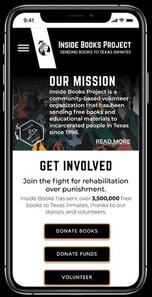
Home Page
.png)

Feedback: The mission statement isn't readable
Solution: I bolded the text and included a 'read more' that directs users to the about page.
Feedback: The call to action is weak
Solution: I differentiated the text and included a more descriptive sub head as well as numerals over written numbers.
Feedback: The image isn't descriptive
Solution: We changed the image to a photo of the process - a volunteer addressing envelopes - rather than the end result.
Feedback: This is a wall of text
Solution: I re-wrote and shortened the copy, created paragraph breaks, and bolded key information.
Feedback: What is the book wishlist?
Solution: We changed it to a donate books section with basic information about how donations work, rather than the more specific wishlist
Feedback: More description on the home page, please
Solution: We created a volunteer section with times to volunteer available at-a-glance.
Donating Books:
Feedback: The order of information is confusing
Solution: We switched 'what to donate' with 'where to donate'
Feedback: The where to donate section is a confusing wall of text
Solution: We differentiated the different drop off and mail locations with sub headers and bolded the important information
Feedback: The book wish list is still confusing
Solution: I edited the explanation text and button. (Adding actual example titles helped too.)
.png)

Feedback: The 'what to donate' section is a confusing wall of text.
Solution: I created categories and visual separation with sub headers and better spacing.
Donating Money


Feedback: The graphic that describes how donations are spent isn't descriptive enough.
Solution: We added percentages, small illustrations, and titles to make the chart more easily readable.
Volunteering:
_edited.jpg)

Feedback: There isn't enough information about what volunteering entails.
Solution: We moved the about volunteering section to the top of the page, added a clearer description, included a quick explanation at the top of the page, and made the menu more readable with bolding.
About Inside Books:
Feedback: Putting 'About Prisons in Texas' first spotlights prisons, not Inside Books.
Solution: We moved the mission statement and impact numbers to the top of the page, and added numerals and illustrations to make our point.
Feedback: The 'Texas Prison System' section has good information that I didn't know before.
Solution: We kept the prison information section, but moved it down the page. We included a more thorough description on the first page, and put the prison abolition movement information behind a 'read more' button.
Feedback: The 'Who We Help' section is really impersonal.
Solution: We made the images more descriptive, and included names and ages on the gallery view of the letters from inmates.


LESSONS LEARNED
Keep the user front and center: THalfway through the project, we had drifted a little to close to only redesigning around the organization's needs, rather than the user's needs. Going back to the problem statement and asking whether or not our choices were increasing trust and credibility was helpful.
Too Wordy: Our users skipped over reading a lot of information. They said that there were too many paragraphs and not enough visual space.
The distraction of moonshots: We ended up spending a little too much time in the grips of scope creep - going outside the bounds of redesigning the website. We got back on track, but it was fun to dream up ways to get audiobooks to inmates.
More testing is always better: We wish that we had thought to test our sight with the users that reviewed the original site, to see if we had resolved their grievances.
NEXT STEPS
A Fleshed Out Volunteer Calendar: Ideally, we would love to expand the volunteer calendar to fully automate the process so that current volunteers could concentrate on something else.
Relevant News Articles: We would love to set up a current news section that keeps up with the news and social media posts about prisons in Texas.
A Wishlist Linked to Local Bookstores: We would love to create a partnership with a local bookstore with direct links for users to buy wishlist books directly.